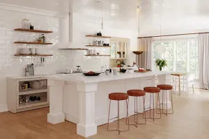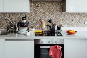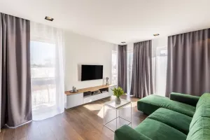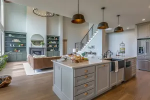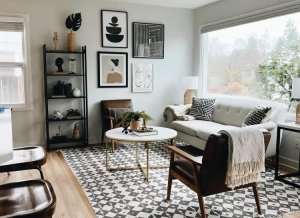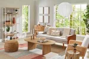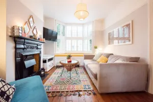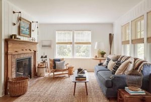
Choosing a paint color can be a daunting task, but avoiding shades that have fallen out of favor can help ensure a home feels current. Interior designers are increasingly steering clients away from certain hues that once dominated walls, citing a shift toward more nuanced and layered palettes. Their guidance offers a roadmap for homeowners looking to refresh their spaces without chasing fleeting trends.
Among the colors drawing the most criticism is builder's beige, a staple of new construction for decades. Jodi Peterman, CEO and owner of Elizabeth Erin Designs, notes that beige often leaves modern interiors looking flat and dated. While its neutrality once made it a safe choice, it now reads as overly cautious. Peterman recommends alternatives like Sherwin Williams Repose Gray (SW 7015) or Benjamin Moore Bavarian Cream (2146-70), which provide a fresher take on neutrals. She suggests pairing these with richer accents such as deep blues or warm earthy tones, and using light or cream furniture to achieve a sophisticated, monochromatic look.
Millennial pink, a defining shade of the 2010s, has also lost its luster. Christiane Lemieux, designer and founder of luxury brand Lemieux et Cie, observes that while the color once felt fresh and modern, it has since cycled out of favor. She advises using it sparingly, perhaps as an accent wall or in decor, rather than dousing an entire room in bubblegum pink. Lemieux is now drawn to softer alternatives like dusty rose, blush, or peach tones for a more timeless appeal.
Hunter Green and the Risk of Overuse
Hunter green, popular in the '80s and '90s, is another shade that designers are approaching with caution. Peterman explains that it often appears too muted or muddy in contemporary settings. She suggests olive green, teal, or emerald as more vibrant and less dated options. For those who already have hunter green walls, Peterman recommends incorporating natural materials like wood and stone to soften the look and create a cozy, organic feel.
Vibrant accent walls, once a go-to for adding drama, are also being reconsidered. Lemieux describes them as potentially overpowering and too deliberate, noting that an ultra-saturated color can become overwhelming when viewed daily. She advises using bold hues in less-frequented spaces or introducing them through decorative elements instead of paint.
Ruthie Staalsen, principal designer and founder of Ruthie Staalsen Interiors, offers a broader perspective: “I think no color is outdated these days,” she says. “What you don't want to do is overdo a color so that it overpowers your home.” Staalsen points to gray, which has been enormously trendy in recent years, as an example. While she still uses gray, she is mindful of how much appears in a space, a principle she applies to all colors. Lemieux adds that cooler grays can feel cold and sterile, recommending warmer tones or using gray in small doses.
For homeowners planning a repaint, the takeaway is not to discard a color entirely but to consider its context and proportion. Designers emphasize balance and the importance of pairing colors with complementary materials and furnishings. As trends evolve, the goal is to create spaces that feel personal and enduring, rather than merely following the latest fad.